
HTML markup
HTML Markup – is a rich text editor that allows users to create formatted content through a convenient interface.
Main Features:
-
Text formatting: bold, italic, underline, strikethrough.
-
Paragraph styles: headings (H1–H6), paragraphs, quotes.
-
Lists: numbered and bulleted.
-
Alignment: left, center, right, justified.
-
Links: insert and edit hyperlinks.
-
Images: add images via upload or by URL.
-
Tables: create and edit tables.
-
Colors: change text and background colors.
-
HTML code insertion: view and edit code ("HTML Source" mode).
-
Undo/Redo: change history.
-
Fullscreen mode: convenient for working with large texts.
-
Find and Replace: quick text search.
The HTML Markup block contains the following parameters:
-
Title – adds a heading to the block that will be displayed on the site (in the top-left part of the block). You can choose the tag type for the heading – H2, H3, H4.
-
Colored Background – adds a colored background across the full width of the page for this block.
Please note! The background color is configured in the unique site appearance settings.
-
Include in Contents – enable this parameter to include the block in the page’s contents or navigation.
Please note! When the "Include in Contents" parameter is enabled, the "Title" and "Anchor" fields are required.
-
Navigation Title – this field defines the name of the block in the page’s navigation list. If navigation is not used, this field is optional.
-
Anchor – enter a unique value (ID) for the block if using it in contents or navigation. This field only accepts Latin letters, without spaces. The value must be unique and not repeated in other blocks.
-
Collapsed View – if the block contains a lot of content (text, images, etc.), you can hide it using this parameter. The parameter activates when there are more than 12 lines of content — everything beyond this is hidden. A Show more button appears to reveal all the content.
-
Create New / Select from List – used to define content:
-
Create New – allows entering data using the HTML editor.
-
Select from List – allows selecting data from the following blocks: "Information about terms of fulfillment, delivery, and order receipt" and "Company description".
-
Please note! When using "Select from List", the text cannot be edited — it is automatically copied from the selected block.
To configure the H1 tag on the page using HTML markup:
-
Write and highlight the desired text
-
Go to the Format menu
-
Then to the Blocks section
-
Select Heading 1
Please note! The H1 tag should appear only once per page to ensure proper search engine indexing.
Slider with images
Image Slider – is a carousel block of images (banners) with the ability to make each image clickable.
Block parameters include:
-
Title – adds a heading to the block, which will be displayed on the website (in the top-left part of the block). You can choose the heading tag type – H2, H3, H4.
-
Colored Background – adds a background color across the full width of the page for this block.
Please note! The color for the colored background is configured in the unique site appearance settings.
-
Include in Contents – enable this parameter to include the block in the page’s contents or navigation.
Please note! When the "Include in Contents" parameter is enabled, the "Title" and "Anchor" fields are mandatory.
-
Navigation Title – defines the name of the block in the navigation list on the page. If navigation is not used, filling this field is optional.
-
Anchor – enter a unique value (ID) for the block when using it in the contents or navigation. The field accepts Latin letters only, with no spaces. The value must be unique and not repeated in other blocks.
-
Banner Height – this parameter controls the height of the banner for both desktop and mobile versions (configured separately for each).
Please note! The width of banners is fixed: 1200px for desktop, 345px for mobile.
Add Banner button – clicking it creates a banner card where you can:
-
Upload an image for desktop/mobile
-
Add Title/alt text (name and alternative name – needed for SEO)
-
Choose Banner Type – a banner can be one of three types:
-
Link – clicking will redirect to the specified link
-
Feedback Form – clicking opens a feedback form
-
Image – a regular banner without interactivity
-
Please note! To change the order of the banners, click on the blue strip to the left of a banner and drag it.
Gallery
Gallery Block – allows you to create content with an image/video gallery for articles, informational pages, etc. It includes the following settings:
-
Title – adds a heading to the block, displayed on the site (in the top-left corner). You can choose the heading tag type – H2, H3, H4.
-
Gallery Type – allows you to select the layout of photos/videos and content. The following gallery types are available:
-
Blocks – text (if present) is placed above the images; photos/videos are displayed as blocks: the first block is large, the next two are small. If there are more than 3 blocks, a View All button appears on the third block, opening the full gallery on click.
-
Blocks + Text Left – text is displayed on the left, blocks on the right; the first block is large, the next three are small. If there are more than 4 blocks, a View All button appears on the fourth block.
-
Blocks + Text Right – text on the right, blocks on the left; same layout and behavior as above.
-
Horizontal Scroll (horizontal images) – text (if present) spans the full width above the image block; images appear as a horizontal slider, 3 per row.
-
Horizontal Scroll (vertical images) – same as above, but 4 vertical images per row.
-
Grid (horizontal images) – text (if present) spans full width above a 4-column horizontal image grid.
-
Compact Grid (vertical images) – text spans full width above a 6-column vertical image grid.
-
Grid (vertical images) – text spans full width above a 4-column vertical image grid.
-
Minimal Horizontal, Text Left – if text is present, it appears on the left occupying the larger portion of the block; images appear as a horizontal slider in the top-right corner. Without text, the slider stretches full width with 3 images per row.
-
Minimal Horizontal, Text Right – same layout as above but with text on the right and slider on the left.
-
Minimal Vertical, Text Left – same as above but with a vertical slider.
-
Minimal Vertical, Text Right – same as above but with text on the right and vertical slider on the left.
-
-
Colored Background – adds a background color across the full width of the page for this block.
Please note! The background color is configured in the unique site appearance settings.
-
Include in Contents – enable this to include the block in the page’s contents or navigation.
Please note! When enabled, the "Title" and "Anchor" fields are required.
-
Navigation Title – defines the name of the block in the page’s navigation list. Optional if navigation is not used.
-
Anchor – enter a unique value (ID) for the block when using contents or navigation. Only Latin characters without spaces are accepted. Must be unique across all blocks.
-
Title Placement – determines how the title is displayed:
-
Title Above Images – the block title appears above the text and images.
-
Title Next to Images – the title appears above the text, next to the image area (when using left or right-aligned text block layouts).
-
-
Content – to add text to the block, click the Add button next to the Content label. An HTML editor opens with an additional parameter:
-
Text Should Wrap Around the Image Block – use this setting if you want the text to occupy the full width and wrap around the image area (in left/right-aligned layouts).
-
-
Add/Edit Photos/Videos Block – to add images or videos, you can upload from your computer or select an album created in My Company → Gallery.
Add Photo – to add a photo, click the Add Photo button. A block will appear where you can:
-
Upload a photo from your computer
-
Add the Title (tittle tag) for the photo
-
Add the Alt tag (alternative name) for the photo
-
Add a Description for the photo
Please note! The Title appears below the photo on the page and above the photo in the gallery view. The Description appears under the photo in the gallery view.
Add Video – to add a video, click the Add Video button. A block will appear where you can:
-
Enter the video URL
-
Add a Description for the video, which will appear below it in gallery view.
Select from Company Albums – to select from existing albums, click Select from Company Albums and choose the desired one from the list.
Please note! When selecting a company album, the entire album is displayed without the ability to edit individual items. However, this allows automation — any new media added to the album will automatically appear in all gallery blocks where the album is used.
To view all types of galleries on the website
Icons
Icons Block – allows you to create unnumbered lists, link to other website pages, display partner/brand blocks, etc., using small images (icons, logos). It includes the following settings:
-
Title – adds a heading to the block, displayed on the website (top-left corner). You can choose the heading tag type – H2, H3, H4.
-
Colored Background – adds a full-width colored background for this block.
Please note! The background color is configured in the unique site appearance settings.
-
Include in Contents – enable this to include the block in the page's contents or navigation.
Please note! When the "Include in Contents" parameter is enabled, both "Title" and "Anchor" fields are required.
-
Navigation Title – defines the name of the block in the navigation menu. Optional if navigation is not used.
-
Anchor – a unique value (ID) entered for the block when used in contents or navigation. Only Latin characters without spaces are accepted. The value must be unique and not duplicated in other blocks.
-
Content – used to add text to the block. Click the Add button next to the "Content" label to open the HTML editor.
-
Button Name – allows adding a button to each icon. When clicked, the user is redirected via a link. For the button to appear, you must provide a Button Name and a Link.
Icon Display Types – control how icons are shown on the page. The following types are available:
-
Horizontal (mobile: 1 per row, desktop: 2 per row) – (icon size: 267x76px):
Icons and their content are displayed 2 per row (1 per row on mobile). Text, name, and button appear to the right of the icon, aligned left. -
Horizontal (mobile: 1 per row, desktop: 3 per row) – (icon size: 96x96px):
Icons and content are displayed 3 per row (1 per row on mobile). Text, name, and button to the right of the icon, aligned left. -
Minimalistic (mobile: 1 per row, desktop: 2 per row) – (icon size: 40x40px):
Icons and content are displayed 2 per row (1 per row on mobile). Text, name, and button to the right of the icon, aligned left. -
Minimalistic (mobile: 1 per row, desktop: 3 per row) – (icon size: 40x40px):
Icons and content are displayed 3 per row (1 per row on mobile). Text, name, and button to the right of the icon, aligned left. -
Vertical (mobile: 1 per row, desktop: 3 per row) – (icon size: 218x136px):
Icons and content are displayed 3 per row (1 per row on mobile). Name, text, and button appear below the icon, centered. -
Vertical (mobile: 1 per row, desktop: 4 per row) – (icon size: 218x136px):
Icons and content are displayed 4 per row (1 per row on mobile). Name, text, and button below the icon, centered. -
Vertical (mobile: 2 per row, desktop: 3 per row) – (icon size: 218x136px):
Icons and content are displayed 3 per row (1 per row on mobile). Name, text, and button below the icon, centered. -
Vertical (mobile: 2 per row, desktop: 4 per row) – (icon size: 218x136px):
Icons and content are displayed 4 per row (1 per row on mobile). Name, text, and button below the icon, centered.
Add Icon button – clicking this opens a block where you can:
-
Upload Icon – the icon size to upload depends on the selected display type
-
Title and Alt Attributes – required for SEO
-
Icon Title – displayed in bold
-
Text – can be any supporting text
-
Redirect Link – allows setting a URL the user will be redirected to upon clicking the icon
-
Open Link in New Tab – enables the link to open in a new browser tab when clicked
To view all types of icons on the website
Lead generation
Lead Generation – a form for submitting a request from a client. The block includes the following settings:
-
Content – an HTML block for entering and editing text.
-
Add Image – allows uploading an image. The recommended size is 576x324px.
-
Button Name – this is a required field.
Field Types for Display (data that the client will fill out to submit the form):
-
Name
-
Email
-
Phone
Related pages
The Related Pages block is intended for placing links to other pages with a short description. You can also use related pages to create blog-type pages that contain links to other articles. This block has the following parameters:
-
Title – adds a heading to the block, which will be displayed on the site (in the top-left part of the block). You can select the heading tag type – H2, H3, H4.
-
Colored Background – adds a colored background across the full page width for this block.
Please note! The background color is configured in the unique site appearance settings.
-
Include in Table of Contents – to have the block appear in the table of contents or on-page navigation, this parameter must be enabled.
Please note! If the "Include in Table of Contents" parameter is enabled, the "Title" and "Anchor" fields become mandatory.
-
Navigation Title – this field defines the name of the block in the page navigation list. If navigation is not used, this field is optional.
-
Anchor – this field requires a unique value (ID) for the block when used in the table of contents or navigation. The field accepts only Latin characters without spaces. The value must be unique and not duplicated in other blocks.
-
Add Button – adds an HTML block for adding content.
-
Button Name – when hovering over the page block, a button will appear. If no button name is provided, the button will not appear.
-
Page Display Type – defines how the title and short description of the page are placed. On the site page, it appears as rectangular blocks with an image, title, description, and button. It displays 3 blocks per row, in 2 rows; if there are more than 6 pages, the rest are hidden under a Show more button (for desktop view), and 1 block per row, in 3 rows; if there are more than 3 pages, the rest are hidden under the Show more button (for mobile view). It has the following options:
-
Description below the image – the page title, short description, and button (if available) will be placed below the image. When hovering over the block, the page title will be underlined.
-
Description over the image – the page title is displayed at the bottom of the image. When hovering over the block, a panel with the title, short description, and button (if available) will unfold over the image.
-
Please note! If the selected page does not have a short description (set in the General Page Settings), only the title will be displayed.
Please note! If the selected page does not have an image (set in the General Page Settings), a default image will be displayed (a gray crossed-out camera icon).
-
Page List – a block for selecting the necessary pages to add. The list includes all created site builder pages. Search by page title or URL is available. You can also select all pages at once by toggling the Select All Pages switch.
Please note! The maximum number of pages that one "Related Pages" block can contain is 18.
Button
The Button block allows you to add a button with optional animation and fix the block at the bottom during scrolling. In this case, the button becomes sticky on the site once the previous block from the current page's block list is scrolled past. The block has the following settings:
-
Mobile Button Label
-
Title – displayed to the left of the button. You can select the heading tag type – H2, H3, H4.
Please note! The color for the colored background is configured in the unique site appearance settings.
-
Desktop Button Label
-
Colored Background – adds a colored background across the full page width for this block.
-
Button Type:
-
Feedback – clicking the button will open a feedback form.
-
Link – clicking the button will redirect to the specified URL. An option is available to open the link in a new browser tab.
-
-
Fix content in the header on scroll (collapsed) – this setting pins the button to the bottom of the window. The button becomes sticky once its original position on the page is scrolled into view.
-
Button Style – defines the button appearance on the site: Primary or Secondary. The style is configured in the unique site appearance settings.
-
Button Animation Type – choose the animation effect. A Preview is also available to see how the button and animation will appear:
-
No animation
-
Pulse
-
Focus icon
-
Diagonal swipe
-
Questions and answers (with microdata)
To configure the Questions and Answers block, the following parameters are available:
-
Title – adds a heading for the block, which will be displayed on the website (top left corner of the block). You can select the heading tag type – H2, H3, or H4.
-
Colored Background – adds a colored background across the full width of the page for this block.
Please note! The background color is configured in the unique site appearance settings.
-
Use in Table of Contents – enable this option if you want the block to appear in the page’s content/navigation list.
Please note! When the "Use in Table of Contents" option is enabled, the "Title" and "Anchor" fields are required.
-
Navigation Title – defines how this block will appear in the navigation list on the page. If navigation is not used, this field is optional.
-
Anchor – this field is for entering a unique value (ID) used for the block in the table of contents or navigation. The field only accepts Latin characters, no spaces. The value must be unique and must not repeat in other blocks.
-
Add Question button – clicking this opens a form to add a new question-answer pair, where:
-
Text – a field for entering the question.
-
HTML Block – a field for entering the answer, using HTML formatting.
-
Contact person
The Contact Person block allows you to add or create an employee whose contact information will be displayed on the page for direct client communication, for example, with a manager. The block includes the following settings:
- Title – adds a heading for the block, which will be displayed on the site (in the top left corner of the block). You can choose the heading tag type – H2, H3, or H4.
- Colored background – adds a colored background across the full page width for this block.
Please note! The background color is configured in the Unique Site Appearance settings.
- Use in table of contents – to display the block in the table of contents or page navigation, enable this option.
Please note! If the "Use in table of contents" option is enabled, the Title and Anchor fields are required.
- Navigation title – this field sets the block name in the navigation list on the page. If navigation is not used, filling this field is optional.
- Anchor – enter a unique value (ID) for this block to be used in the table of contents or navigation. Only Latin characters are allowed, without spaces. The value must be unique and not repeated in other blocks.
- Contact person parameter:
- Create new – create a new contact person by adding:
-
Image – must be 98x98 px
-
Name (required) – the name to be displayed
-
Position (required) – the person's job title
-
Phone number (required) – up to 5 phone numbers can be added
-
Email address
-
Languages spoken – up to 4 languages can be specified
-
- Select from list – you can choose an existing contact person from the list. These contact entries are created in the My Company section, under Contact Person. When selected from the list, available data will be displayed. You can choose which fields to show by checking the corresponding boxes.
- Create new – create a new contact person by adding:
- Button label – the label that will be shown on the button, which can trigger the following actions:
-
Link – add a link that the user will be redirected to. You can also enable the link to open in a new tab.
-
Feedback form – opens a feedback form.
-
- There’s also an option to add an additional link displayed below the button (blue colored). To add it, fill out:
-
Link label – the text that will be displayed on the site.
-
Redirect URL – the link the user will be redirected to upon clicking. You can enable "Open link in a new tab" by selecting the corresponding option.
-
Goods
The Goods block allows you to add products to the page — either all available products, products from specific categories, or promotional products. The block includes the following settings:
- Title – adds a heading for the block, which will be displayed on the site (top left corner of the block). You can choose the heading tag type – H2, H3, or H4.
- Colored background – adds a colored background across the full page width for this block.
Please note! The background color is configured in the Unique Site Appearance settings.
- Use in table of contents – to display the block in the table of contents or page navigation, enable this option.
Please note! When the "Use in table of contents" option is enabled, the Title and Anchor fields are required.
- Navigation title – this field sets the block name in the navigation list on the page. If navigation is not used, filling this field is optional.
- Anchor – enter a unique value (ID) for this block to be used in the table of contents or navigation. Only Latin characters are allowed, without spaces. The value must be unique and not repeated in other blocks.
- Content – when clicking the Add button, an HTML block opens where you can write content.
- Goods settings type:
-
Show all categories – adds a product block with tabs representing the product categories available on the site.
-
Add products by link – allows you to add products from a single category (e.g., Windows, Entrance Doors, etc.). You can also add products filtered by specific criteria – to do this, go to the product list page, apply the desired filters, copy the resulting link, and paste it into the Link field.
-
Show all categories (promotional products only) – adds a block with all promotional products from all categories.
-
Table of contents
The Table of contents block is used for on-page navigation in the form of a list of items. When clicked, each item scrolls the page to the corresponding section. This type of navigation is especially useful when the page contains many blocks, allowing users to quickly find the desired section.
Please note! For blocks to appear in the table of contents, the "Use in table of contents" option must be enabled in those specific blocks.
Available settings:
-
Title – Adds a heading to the block, which will be displayed on the site (in the top left corner of the block). You can choose the heading tag type: H2, H3, or H4.
-
Colored background – Applies a colored background across the full width of the page for this block.
Please note! The color for the background is configured in the site’s unique appearance settings.
-
Collapsed by default – The table of contents block will appear in a collapsed state. To view all the items, users will need to expand it.
-
Stick TOC to the header on scroll (collapsed) – The TOC block will remain collapsed while scrolling and will be pinned to the bottom part of the header. Additionally, if the TOC block is not placed at the top of the page, it will stick to the bottom of the header once it comes into view during scrolling and stay pinned until the end of the page.
Navigation
The Navigation block is used for on-page navigation in the form of a vertical slider-strip with items. As the user scrolls to a section listed in the navigation, the corresponding item will be highlighted and its text color will change.
Please note! For blocks to appear in the navigation, the "Use in table of contents" option must be enabled in those specific blocks.
Please note! The Navigation block is always placed at the top of the page, before all other blocks.
Available settings:
-
Colored background – Adds a colored background across the full width of the page for this block.
Please note! The background color is configured in the site’s unique appearance settings.
-
Stick TOC to the header on scroll (collapsed) – The block will be pinned to the bottom part of the header while scrolling.
Q&A / User reviews
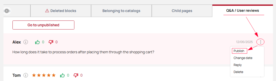
The Q&A / User Reviews block allows users to leave comments (reviews and questions) on the page. Only one such block can be added per page. To manage interactions with comments, there is a Q&A / User Reviews tab in the page settings where all user-submitted reviews/questions are displayed.
Please note! For a review to appear on the page, it must be published. To do this, go to the Q&A / User Reviews tab, click the three dots next to the review, and select Publish from the menu.
Block Settings:
-
Title – Adds a heading to the block that will be displayed on the site (in the top-left corner of the block). You can select the heading tag type: H2, H3, or H4.
-
Colored background – Adds a colored background that spans the full width of the page for this block.
Please note! The background color is configured in the unique site style settings.
-
Include in table of contents – To make the block appear in the page’s table of contents or navigation, enable this setting.
Please note! When this option is enabled, the Title and Anchor fields become required.
-
Navigation title – This field sets the block name as it appears in the page navigation list. If navigation is not used, filling in this field is optional.
-
Anchor – This field defines a unique identifier (ID) for the block when used in the table of contents or navigation. Only Latin characters are allowed, with no spaces. The value must be unique and not repeated in other blocks.
-
Button label – To leave a review or question, the user must click a button to open a modal input form. You can specify any label for this button.
Company reviews
There is a Company Reviews page in the system, available at the link https://yourwebsite.com/sitelanguage/reviews (for example: https://manual.vitrager.com/en/reviews). To display reviews on the site pages, there is a block called Company Reviews. It has the following settings:
Please note! The Company Reviews block only displays reviews. If there are also questions, they can be viewed only by going to the Company Reviews page.
- Title – adds a heading for the block, which will be displayed on the site (in the top left corner of the block). You can choose the heading tag type – H2, H3, H4.
- Colored background – adds a colored background across the full width of the page for this block.
Please note! The color for the colored background is configured in the unique site appearance settings.
- Use in Table of Contents – to include the block in the page contents or navigation, this parameter must be enabled.
Please note! When the "Use in Table of Contents" parameter is enabled, the "Title" and "Anchor" fields are mandatory.
- Navigation title – this field defines the block's title in the navigation list on the page. If navigation is not used, this field is optional.
- Anchor – this field is for entering a unique value (ID) for the block when used in the contents or navigation. The field accepts only Latin characters, no spaces. The value must be unique and not repeated in other blocks.
- Add button – adds an HTML block for adding content.
- Show buttons – enables display of buttons like “Show All” (which leads to the reviews page) and “Leave a Review” (which opens a modal window for submitting a review or question). If this parameter is disabled, the reviews will be displayed as a slider with no interaction available.
- Button title 1 – sets the label for the button that leads to the reviews/questions page.
- Button title 2 – sets the label for the button that opens the modal window for submitting a review or question.
Calculator
The Calculator block allows you to create blocks of additional assortment products with the option to submit a purchase request for them. On the website, the block consists of two steps:
-
Selecting the desired product.
-
Entering dimensions to preview the price and submit a purchase request.
Please note! The Calculator block only allows users to preview the price and submit a request. The actual order is created only by a company manager — users cannot place orders directly through the site.
The block has the following settings:
- Title – adds a title for the block, which will be displayed on the site (top left corner of the block). You can choose the heading tag type – H2, H3, H4.
- Colored background – adds a full-width colored background for this block.
Please note! The color for the background is set in the unique site appearance settings.
- Use in Table of Contents – to include the block in the contents or page navigation, this parameter must be enabled.
Please note! When the "Use in Table of Contents" parameter is enabled, the "Title" and "Anchor" fields become mandatory.
- Navigation title – defines the name of the block in the page’s navigation list. This is optional if navigation is not used.
- Anchor – enter a unique value (ID) for the block to be used in the Table of Contents or navigation. This field accepts Latin letters only, no spaces. The value must be unique and not used in any other blocks.
- Add button – adds an HTML block to fill with content.
- Step 1 title – sets the title that will be displayed for step 1.
- Description – description displayed below the title in step 1.
- Button text – the label of the button displayed on each product.
- Content display – allows you to choose the layout type for product display on desktop. The options are:
-
-
1 row, 3 per row – displays one row of 3 product cards; navigation via “Next” and “Previous” buttons.
-
1 row, 4 per row – displays one row of 4 product cards; navigation via “Next” and “Previous” buttons.
-
2 rows, 3 per row – displays two rows of 3 product cards (6 total); navigation via “Next” and “Previous” buttons.
-
2 rows, 4 per row – displays two rows of 4 product cards (8 total); navigation via “Next” and “Previous” buttons.
-
3 rows, 3 per row – displays three rows of 3 product cards (9 total); navigation via “Next” and “Previous” buttons.
-
3 rows, 4 per row – displays three rows of 4 product cards (12 total); navigation via “Next” and “Previous” buttons.
-
- Step 2 title – sets the title that will be displayed for step 2.
- Description – description displayed below the title in step 2.
- Link to instruction "How to take measurements correctly" – you can add a link to a page with measurement instructions if needed or available.
- Button text – label of the button used to submit the request.
- Accessories - to select the required products, click the "Edit" button. A modal window will open where you can configure:
-
-
Supplier – choose a supplier from the list (if you are a dealer). If you are a manufacturer, you will only see "My Accessories".
-
Select category – clicking the field opens a list of additional products grouped by categories and subcategories. Categories are displayed in bold. You can only select subcategories.
-
After selecting a subcategory, a list of available products appears. Click the desired item to select it.
-
To select all products in a subcategory, use the "Select all" toggle.
- After clicking the "Select" button, a list of selected products will appear, showing:
-
Supplier name
-
Number of selected items
-
List of selected products
-
-